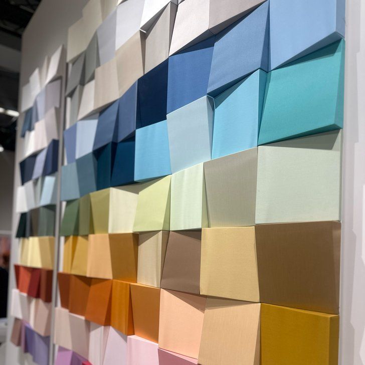
Pantone COTY 2020 announced: Classic Blue
The wait is over, Pantone has announced its much anticipated Colour of the Year for 2020: Classic Blue.
In an interview with TIME magazine, Laurie Pressman, Vice President of the Pantone Color Institute, said of the selection: “It’s a reassuring blue, full of calm and confidence. It builds connection.
“The sky at dusk – it’s not a midnight blue, it’s thoughtful, but it’s not so deep and mysterious. It speaks to our feelings of anticipation, when you think about the sky at dusk, the day isn’t over. You’re thinking, what’s ahead of us? It’s reassuring, but thought-provoking.
“It highlights our desire for this dependable, anchoring foundation on which to build as we cross the threshold into a new era. We’re living in a time that requires trust and faith and confidence. We all see this blue sky and can relate to it, it’s approachable.”
Both comforting and relatable, the calming indigo shade has been chosen with a reassuring effect in mind. After a politically turbulent 12-months, Classic Blue is Pantone’s hand on society’s shoulder, the colour equivalent of “we’ve got you”.
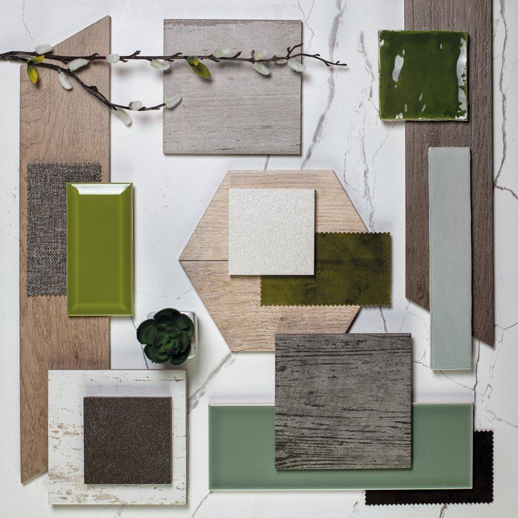
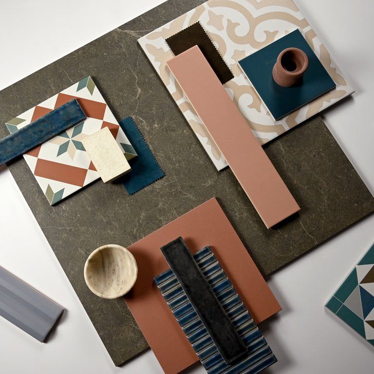
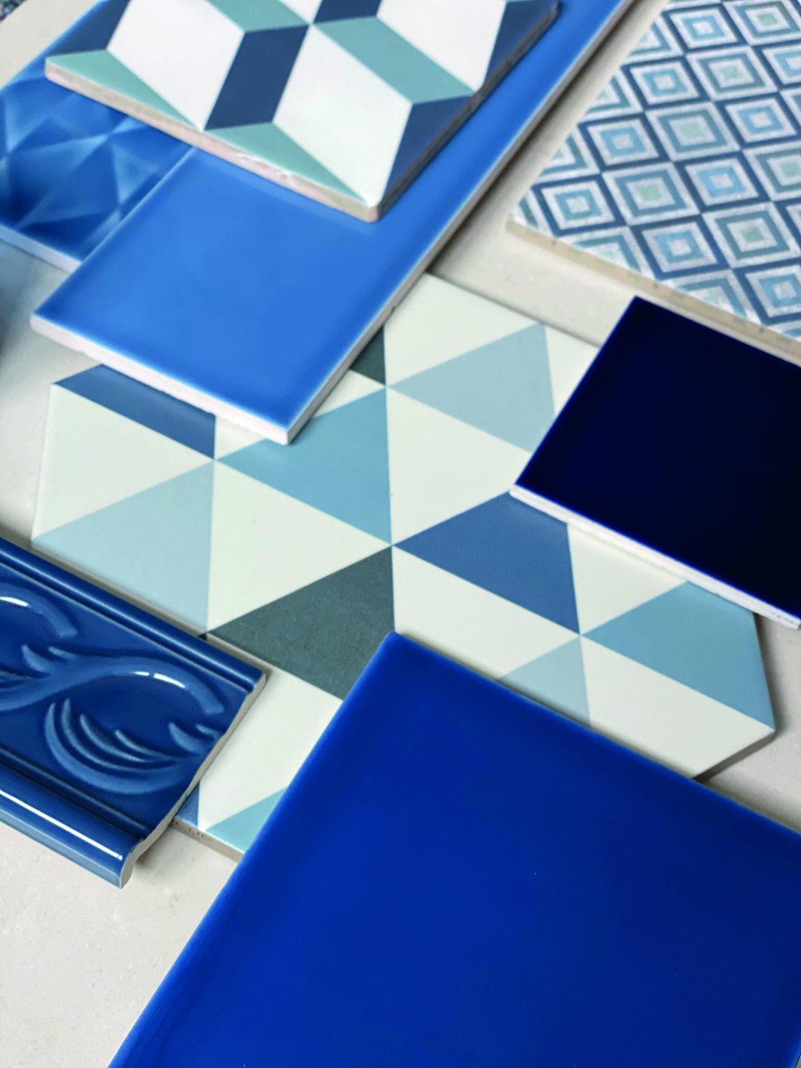
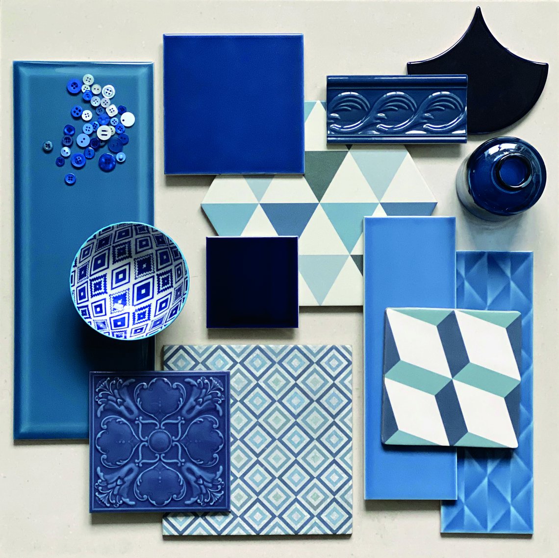
Reminiscent of the sky at dusk, it’s a universally connective colour that’s already making waves commercially. We’ve long been fans of a blue hue at Johnson Tiles. From Prismatics to Savoy, and whether for hospitality or residential settings, we believe there’s no better shade to help set a tranquil ambience.
To inspire your upcoming projects, our designer Amy Pears has created a moodboard showcasing some of our complementary products to help you ‘get the look’.
Head over to Instagram to let us know what you think of Classic Blue, and discover more exclusive inspirational content.