Pantone’s Colour of the Year 2017 is Greenery
The wait is finally over. Pantone has just announced the Colour of the Year for 2017 and it’s Greenery, something that the standardised colour matching system believes reconnects us with nature and a larger purpose in life.
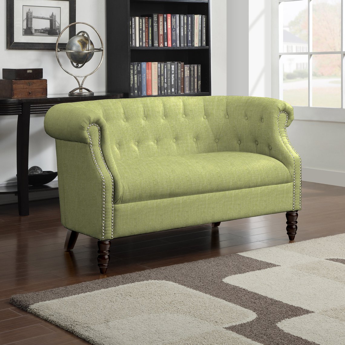
Speaking of home decor and architecture, Pantone states: “Open spaces in interior and exterior design and floor-to-ceiling windows allow the green outdoors to become part of a room’s backdrop and ambiance. Adding Greenery through living walls, terrariums, botanically-themed wallpaper, paint, accent furniture and decor provides respite and breathing space. “Bringing the outside in, the shade – like the plant life it represents – can improve self-esteem, reduce anxiety and heighten awareness of one’s surroundings.”

Obviously, as a leading British manufacturer it’s our duty to stay ahead of the trends and meet the changing demands of the architecture and design industry. Pantone’s annual event is an essential on our calendar, and one that inspires our Design Team when creating new collections for our tile ranges, or suggesting complementary colour schemes for our clients.
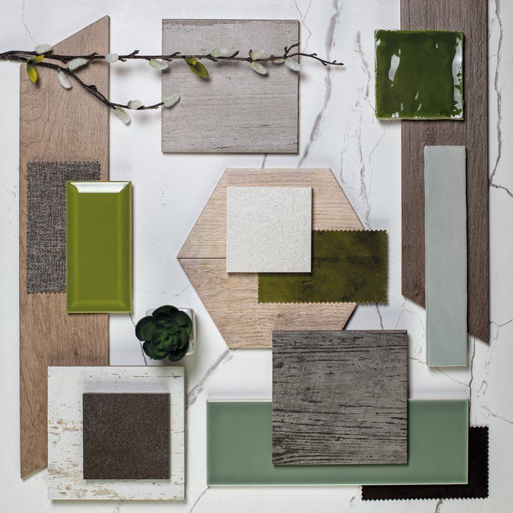
Using Colour Genie – our popular tool that matches any colour to our products – we’ve picked out some of our own tiles that complement Greenery, including hues from our Prismatics and Minton Hollins ranges. If you’re planning more serene and green colour schemes for 2017, then our experts at Johnson Tiles will be more than happy to discuss suitable wall and floor tiles to add to your projects.

Following on from 2016’s two pastel hues Serenity and Rose Quartz – which called for peace and harmony in a chaotic world – this new hue aims to give us something else to look forward to, despite the turbulent times in which we currently live.
Our Design Team at Johnson Tiles has been at the exclusive launch event in London today, hearing from some of the leading representatives of Pantone on why Greenery is the colour of choice for next year.
“While Serenity and Rose Quartz expressed the need for harmony in a chaotic world,” said Leatrice Eiseman, Executive Director of the Pantone Color Institute, “Greenery bursts forth in 2017 to provide us with the hope we collectively yearn for amid a complex social and political landscape. Satisfying our growing desire to rejuvenate, revitalise and unite, Greenery symbolises the reconnection we seek with nature, one another and a larger purpose.”